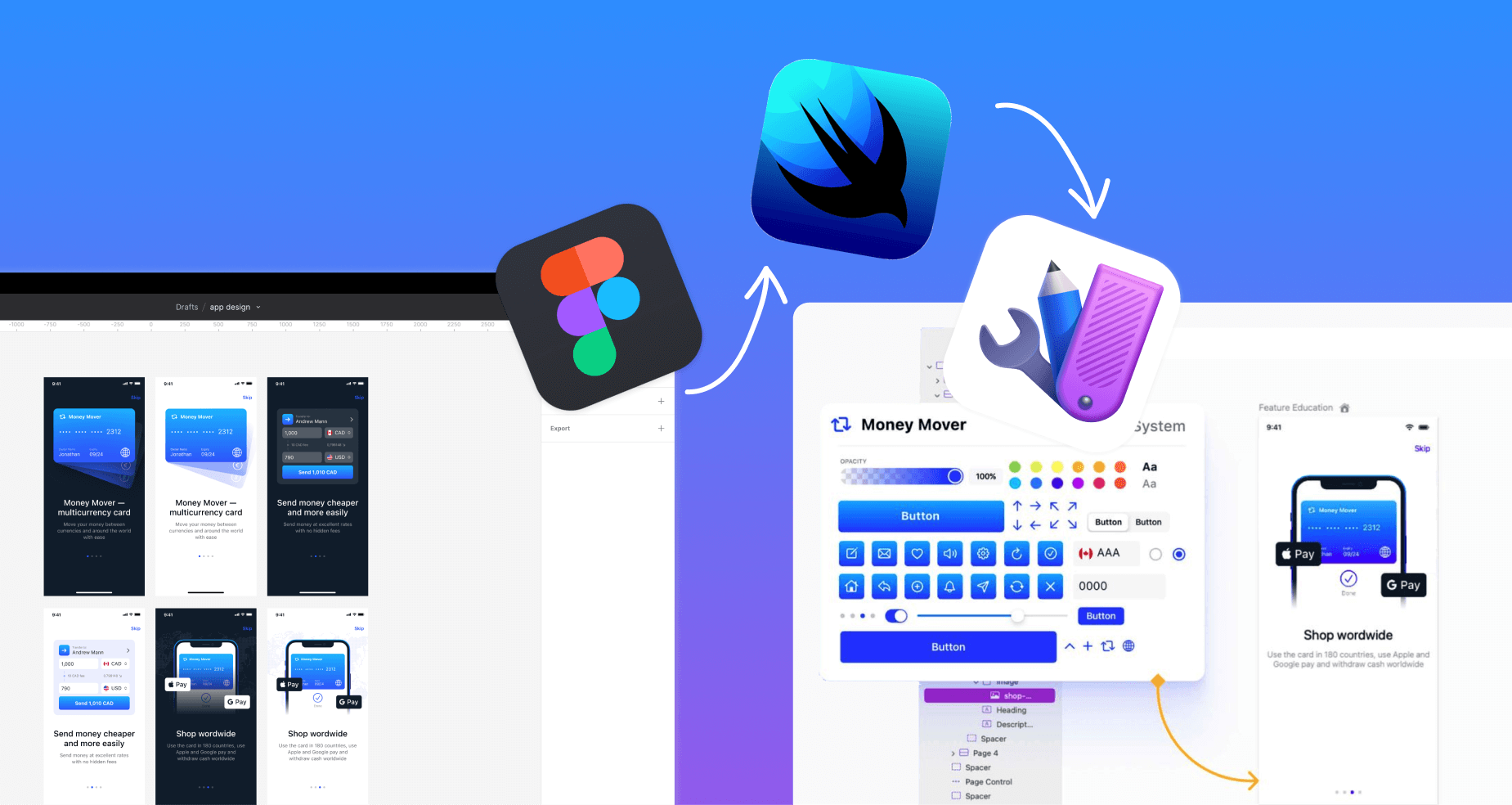
Today’s Designers are more technically capable and increasingly, have an appetite to better understand the platforms and programming languages they are designing for. A better level of understanding helps teams build products faster and more effectively, eliminating back and forth between designers and developers. By understanding the relevant building blocks of SwiftUI and how they translate to Figma, designers can hand off designs that consider the fundamental components and constraints of the framework.
For designers using Figma, looking more deeply into how concepts in Figma translate to SwiftUI is an important place to start. Specifically, understanding how Custom Views, Properties and Auto Layout translate in SwiftUI can help designers better understand the framework.
Components → Custom Views
In Figma, a component is a saved version of a design that can be reused in other places within the same file or in other files. Custom views can be useful for a variety of purposes, such as:
- Creating a library of reusable design elements
- Creating alternate versions of a design
- Sharing designs with others
In SwiftUI, we can similarly look at custom views. Similar to custom views, a component is a reusable piece of UI that can be used to build the user interface of an app. Components can include simple elements like buttons and text fields, as well as more complex elements like tables and lists.
Using components in SwiftUI can help you to build your app's UI more efficiently and with a consistent visual style. When you make changes to a component, those changes are automatically reflected in all of the places where the component is used, which can save you time and ensure that your app has a consistent look and feel.
SwiftUI provides a range of built-in components that you can use in your app, such as buttons, sliders, and text fields. You can also create your own custom components by combining other views and UI elements.
Properties → State Variables
In Figma, properties are settings that control the appearance and behavior of an object, such as its size, position, color, or font. Properties can be adjusted using the properties panel or the inspector, which are located on the right side of the Figma interface.
Properties are an important part of working with Figma, as they allow you to customize and fine-tune the various elements of your design. For example, you can use the properties panel to change the size and position of an object, or to adjust its color, font, or other visual properties. Properties can also be animated in Figma using the prototyping tools. This allows you to create interactive designs that change over time in response to user input or other events.
Similarly to Figma, in SwiftUI, state variables are values that can be modified by the app and are used to store the current state of the app. When the value of a state variable changes, the framework automatically updates the views that depend on that value, which allows you to build dynamic and responsive user interfaces.
To create a state variable in SwiftUI, you can use the @State property wrapper. This wrapper tells the framework that the value of the variable can be modified and should be observed for changes.
For example, here is how you could create a state variable in SwiftUI to store the current value of a text field:
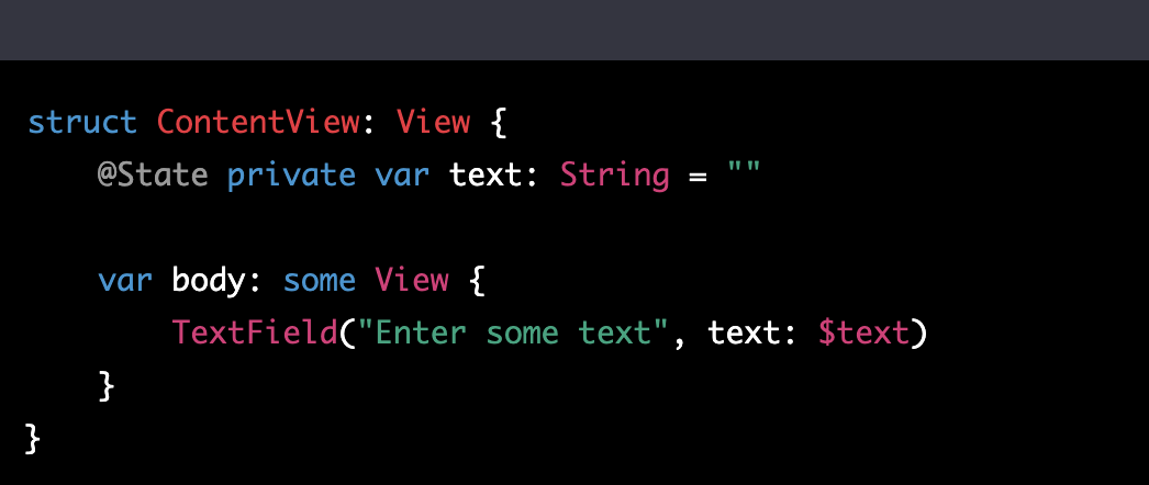
In this example, the text variable is a state variable that is used to store the current value of the text field. The TextField view is bound to the text variable using the $ prefix, which tells the view to observe the variable for changes.
When the user enters text into the text field, the value of the text variable is updated, and the view is automatically updated to reflect the new value. This allows you to create interactive and dynamic user interfaces without having to manually update the views yourself.
Auto Layout → Vstacks and Spacers
Auto Layout is a Figma feature that allows you to create layout constraints for objects in your design. These constraints specify how the objects should be positioned and sized relative to each other, and can help you to create designs that are flexible and responsive to different screen sizes and layouts.
To use Auto Layout in Figma, you first need to select the objects that you want to constrain. You can then use the layout options in the properties panel or the inspector to specify the constraints that you want to apply. For example, you can use constraints to specify that an object should be centered horizontally or vertically within its parent, or that it should have a fixed distance from other objects.
In SwiftUI, VStacks, Spacers and Modifiers ensure responsive, clean layouts. A VStack is a view that arranges its children vertically in a stack. You can use a VStack to lay out a series of views vertically, one on top of the other.
For example, here is how you could use a VStack to lay out a label and a button vertically:
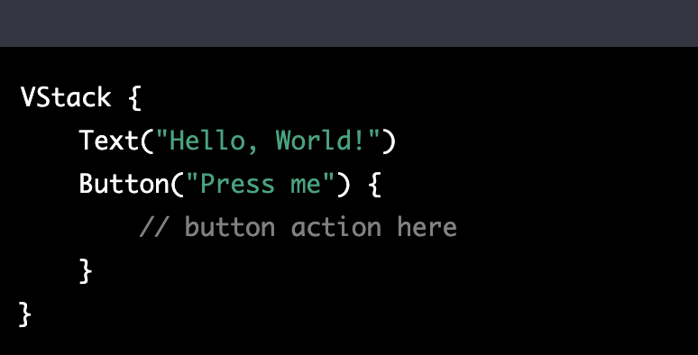
In this example, the Text and Button views are children of the VStack, and will be displayed vertically in the order that they are defined.
You can also use Spacer views within a VStack to add blank space between the other views. Spacer views take up any remaining space in the stack, which can be useful for creating flexible layouts.
For example, here is how you could use a Spacer to add space between the label and button in the previous example:
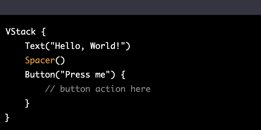
In this example, the Spacer view will take up all of the remaining space in the VStack, which will push the button to the bottom of the stack. This can be useful for creating flexible layouts that adjust to the available space.
The Takeaway
A better understanding of SwiftUI empowers designers to take their designs further, proactively factoring in considerations important to the development process. By understanding key tenants of the framework and how concepts in Figma translate to SwiftUI, designers and developers can work more effectively. At Judo, we’re building a product focused on just that - a canvas for designers and developers to build UI better. Give it a try for free!