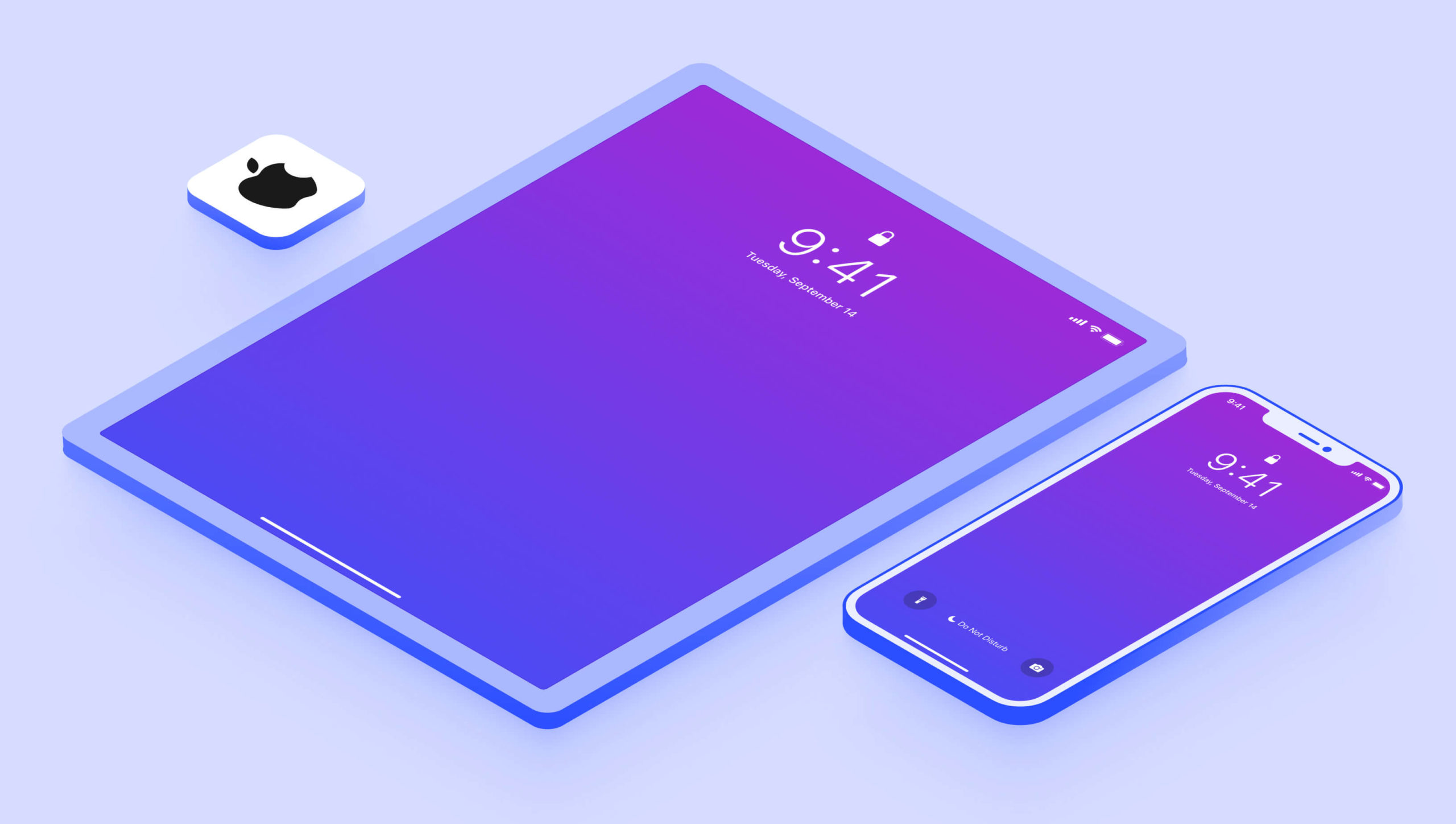
You’ve always been able to design for iPad with Judo but until today there was no way to simulate an iPad on the canvas. This week we released Judo 1.11 and included support for just that.
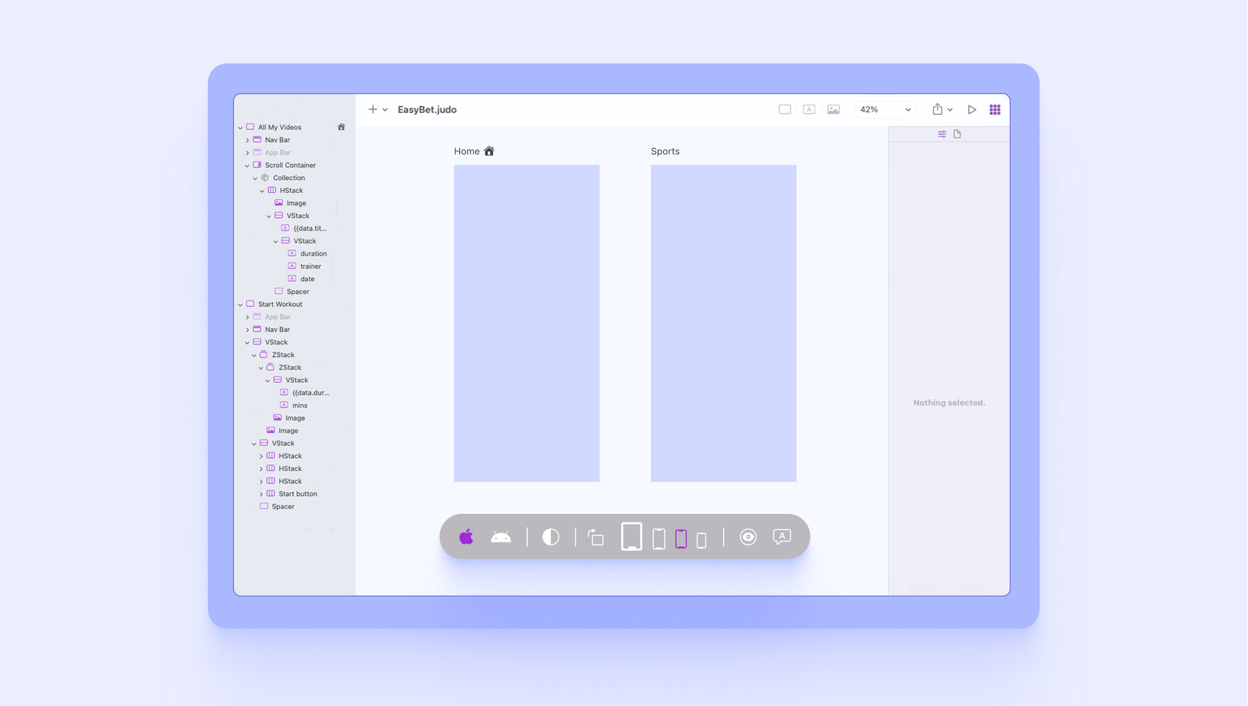
Judo’s visual canvas gives you a preview of what your experience will look like when it’s rendered on an actual device. Our goal with the canvas is to be as accurate as possible—there should be no surprises when the experience you designed on your Mac is opened on your phone. When we decided to add support for iPad we wanted to do it right. We started by digging into Apple’s Human Interface Guidelines (“the HIG”) to understand the differences between iPhone and iPad beyond just screen size. We uncovered quite a few differences but two were particularly relevant to Judo: Navigation bars and modal presentation.
Navigation Bars
The styling of navigation bars on iPhone and iPad is pretty much identical but it turns out the height of the bars is different. On iPhone the height of a navigation bar is 94 points but on iPad it’s only 74.
When you compare the devices in landscape, the difference is even more drastic. The navigation bar on iPhone is compressed to 32 points in landscape mode. This makes sense since there is much less vertical space on a phone when it is held sideways. On iPad there remains ample vertical space in landscape and the navigation bar height remains at the full 74 points.
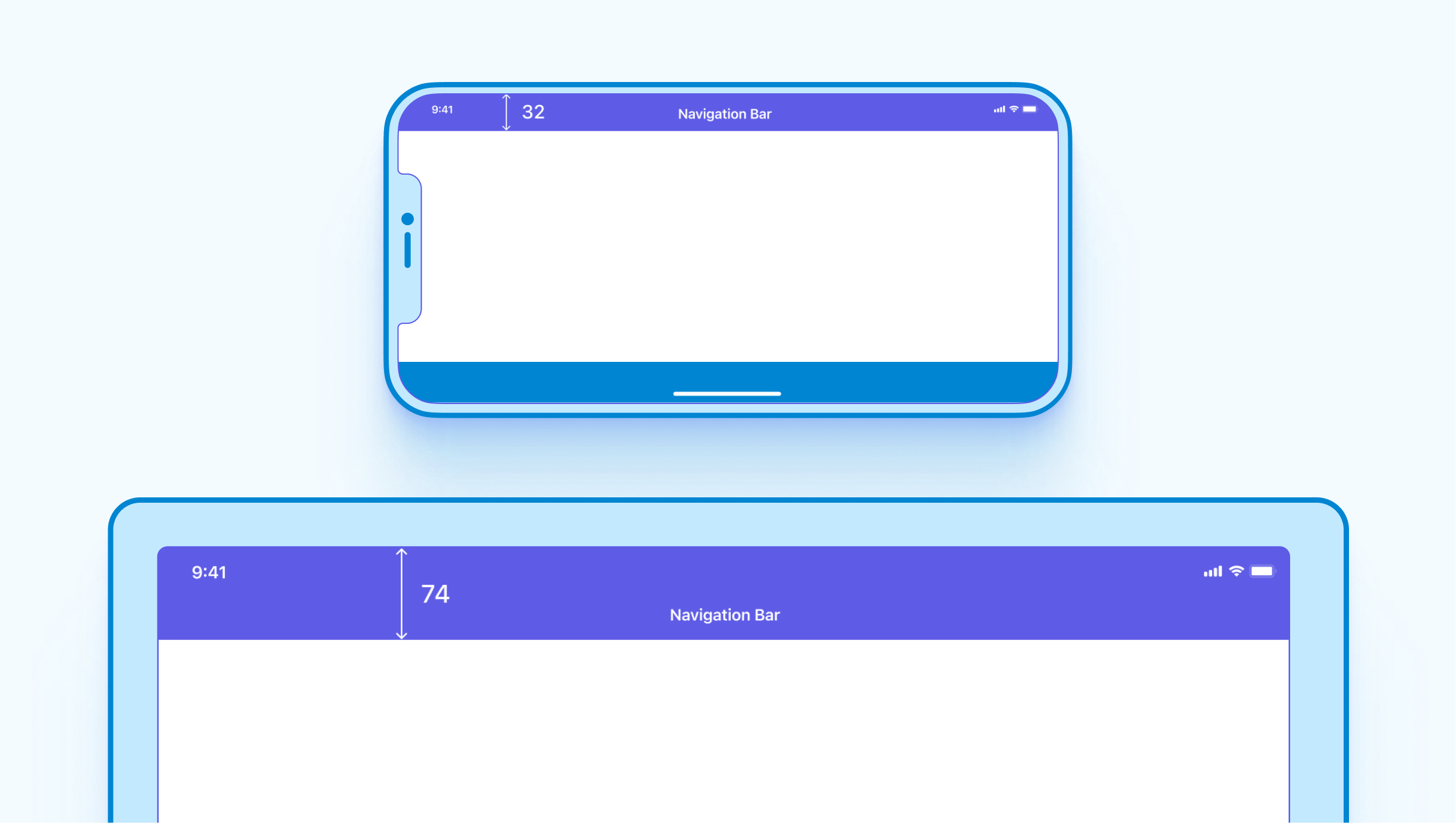
When you add a navigation bar to a screen in Judo, the canvas ensures the height is accurate depending on whether your preview settings are set to iPhone or iPad.
Modal Presentation
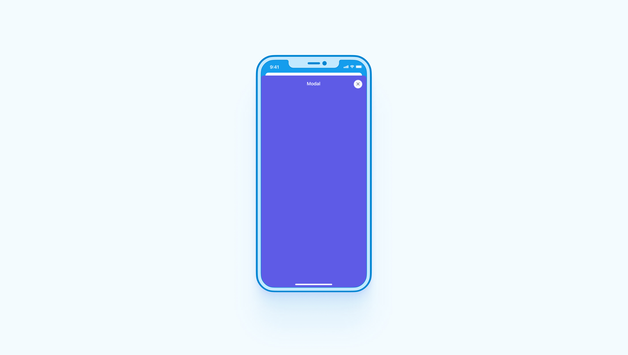
In UI design, a modal is displayed on top of a main view in such a way that the main view is still visible, but disabled. The user must interact with the modal before they can return to the main view. iOS has built-in support for modals and Judo has always supported the ability to present one screen on top of another screen—modally.
On iPhone, a modal takes up the full width of the screen but is slightly offset from the top edge so you can see the underlying main screen behind it. This maximizes the size of the modal while still providing a visual cue that one screen is on top of the other.
On iPad, modals are offset from each edge of the screen with a darkened overlay behind it. This is a more traditional way of displaying a modal and what most people visualize when they hear the term.
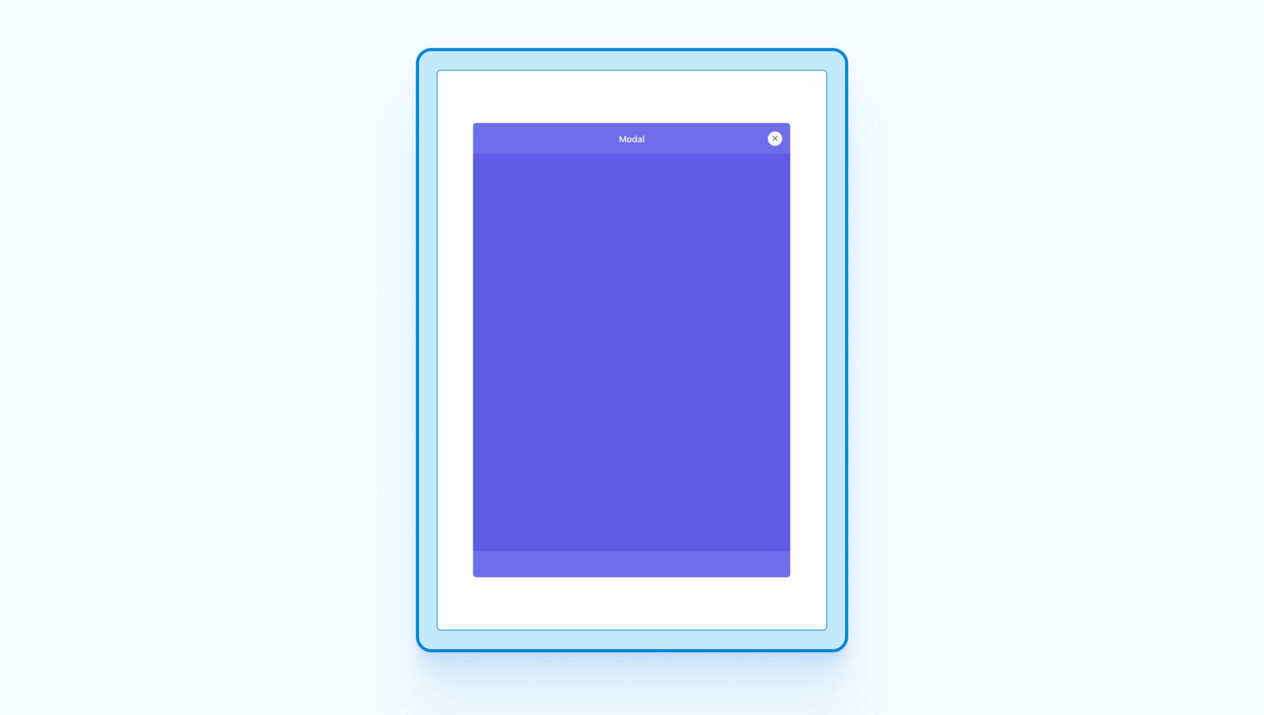
The Judo canvas takes this into consideration and displays your modal screens in the proper style depending on your preview settings.
Pixel-perfect Previews
We sweated the details for iPad support in Judo because accurate previewing is one of our most valuable features. As a platform-specific design tool, Judo puts guardrails up that you keep you within the constraints of what’s possible. The details of “the HIG” are built-in to the product which ensures that developer handoff is seamless.
Screen size and orientation (portrait vs. landscape) are two variables that affect how your design will appear to different users but there are many others to consider:
- Dark mode versus light mode
- The user’s preferred language
- Accessibility settings such as larger text sizes and increased contrast
With Judo you can test your design against various scenarios directly on the canvas and make sure your layout adapts correctly in all cases. This eliminates the back-and-forth that commonly occurs between design and engineering. With Judo, the deliverable is more than just a design, it’s a fully functional user interface. This capability is so important that in 1.11 we’re introducing new dedicated controls that make previewing faster and easier to use.
New Preview Controls
When you open Judo this week you’ll see the new controls, always within reach, at the bottom of the canvas. With these controls you can quickly switch between iOS and Android, toggle dark mode, try different languages, test accessibility settings, rotate orientation, change device size and of course, preview your design on iPad :)
Conclusion
At Judo, we believe the line between design and development is blurring. Designers can deliver more than static images and developers can benefit from visual build tools. When the details of the platform you’re building for are built-in to the tools you use, new workflows become possible. We’re on a mission to make product teams more productive and make building software more enjoyable. Adding support for iPad is one small step in on our journey.